


For designing your own custom neon sign, fonts and colors are the core of the design. Not only do they establish the atmosphere and personality of your environment, but they guarantee that your sign attracts attention whether for your home, event, or business.
With the right decisions, your neon lights have the potential to transform any wall into a beautiful piece of art that shines with creativity and style. Let's take a look at how to choose the ideal combination of colors and fonts for your personalized neon lights that express your vibe.
1. Know the Function of Your Neon Sign
If you are designing neon lights for your company or cafe, choose colors that suit your brand identity. Amber or red might be warm and dynamic colors, but blue or white can provide a clean, contemporary image.
In the case of personal rooms like bedrooms, game rooms, or parties, you can be more adventurous with your choices - pinks, purples, or even colored gradients. A personalized neon sign board provides a personal touch and allows you to express your personality or theme in a glowing, fashionable manner.
2. The Psychology of Color in Neon Lighting
Colors are more effective than words. Every hue has a distinct emotional impact, and when used in neon lighting, that impact increases with added strength. Here is the fast guide to assist you in deciding:
Red: Passionate, bold, and captivating. Ideal for restaurants, bars, or signboards.
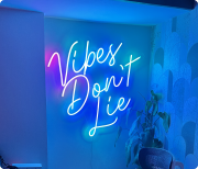
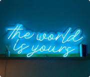
Blue: Relaxing, reliable, and cool - best suited for offices, spas, or contemporary homes.
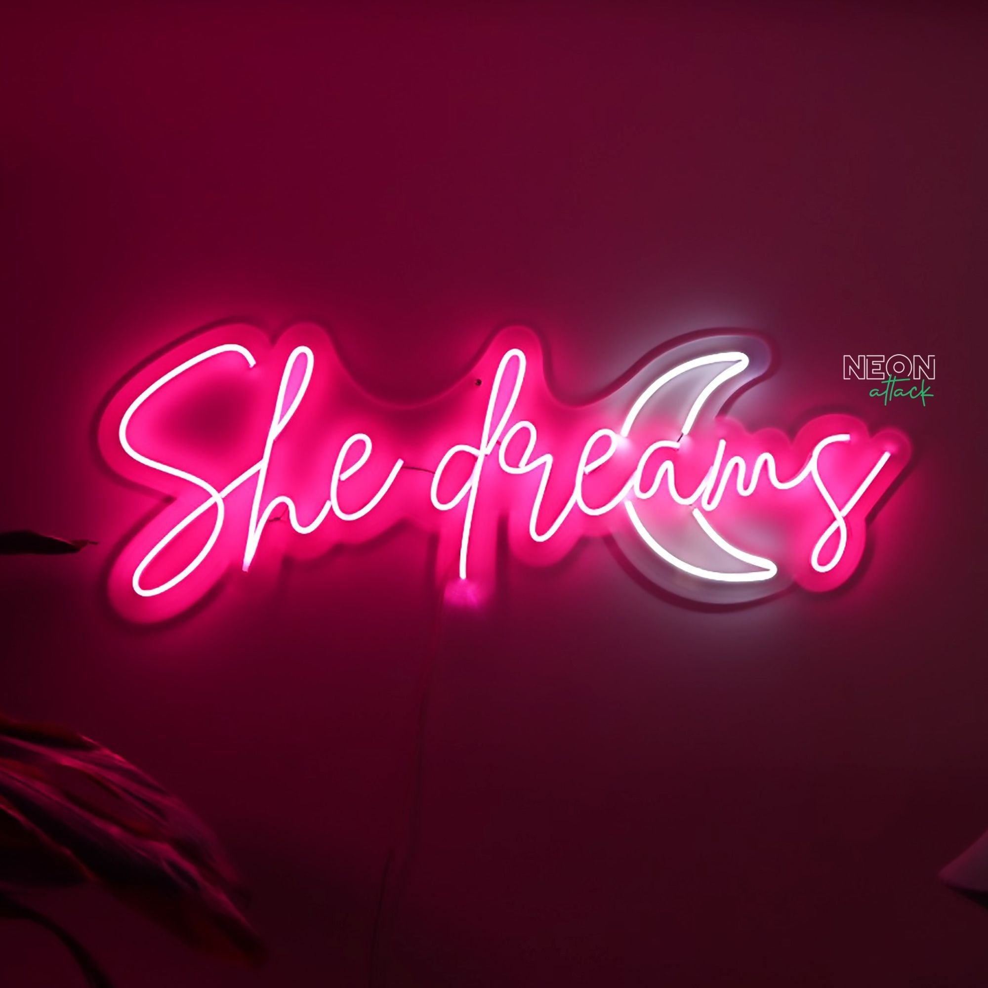
Pink: Playful, loving, and fashionable - perfect for spas, bedrooms, or wedding arrangements.
White: Pure and simple - suitable for sophisticated interiors or workspaces.
Green: Invigorating and vibrant - ideal for green brands or island themes.
When in doubt, visualize how your chosen color will look in your space under different lighting conditions. Neon Attack’s design tool makes it easy to preview your custom neon sign in real time before ordering
3. Color-Coordinating to Your Environment
Your neon sign must blend with the décor around it, not compete against it. If your room has an existing bold color scheme, use an elegant white or golden yellow hue for contrast.
If your walls are a neutral shade, however, vibrant neon lights can provide an immediate injection of personality. For instance:
Pastel pink neon text in a sparse room adds a touch of softness.
A bright blue or red neon sign appears dazzling against brick or concrete walls.
Keep in mind that balance is everything - your neon lights should add to your space without dominating it.
4. Selecting the Proper Font Style
As with colors, fonts have a lot of influence on how your message reads. A "Hello Gorgeous" written in cursive has a totally different feel from a "GOOD VIBES ONLY" written in bold and uppercase letters.
Here's how to select the proper one:
Cursive Fonts: Elegant, feminine, and romantic - best for weddings, boutiques, or home decor.
Bold Sans Serif Fonts: Tough and contemporary -excellent for companies, gyms, or signs that have to be noticed.
Handwritten Fonts: Approachable and informal - perfect for custom personalized neon signs or presents.
Ensure your selected font is legible from afar, particularly if your neon sign is for a storefront or event background.
5. Blend and Match for Original Effects
Why should you limit yourself to a single color or font? Blending styles can produce a vibrant, creative atmosphere.
Experiment with combining two contrasting colors - say, warm orange and cool white - to emphasize certain words in your personal neon signs.
Or utilize varying font weights to highlight important sections of your message, such as "Good Vibes" in bold and "Only" in script. Neon Attack allows you to try out various design pairs so you can have a unique piece.
6. Stay Current with the New Neon Design Trends
Neon lighting in 2025 is no longer just for business - it's a standard part of interior design. Elements of some of the more recent trends include:
Gradient neon effects: A mixing of two or more colors gradually blending into each other. Adding RGB light technology enables you to dynamically change colors, creating bright transitions and mood-lit lighting.
Minimalist fonts: Clean, modern typefaces leaving the focus on the glow.
Custom symbols and shapes: Hearts, logos, or stars to further express your custom neon lights.
Interactive designs: Merging neon with mirrors or art prints for a textured, artistic look.
Incorporating these trends - and playing around with RGB light for increased versatility - can make your design fresh and eye-catching for years to come.
7. Practical Advice Before You Complete Your Design
Take your wall dimensions: Verify the space to make sure your neon sign fits comfortably.
Choose the right brightness: Indoor signs need a dimmer light, while outdoor ones need higher intensity.
Double-check power positioning: Verify there is an accessible outlet to tuck wires in neatly.
Choose LED neon lights: They use less power, last longer, and are safer than glass neon.
While selecting your neon light name, select something brief, appealing, and significant - a word or phrase that best represents your brand, attitude, or image.
Neon Attack incorporates top-quality LED tubes in all of its specialty neon lights, giving you a long-lasting glow without high energy bills.
Final Thoughts
Designing a custom neon sign is your chance to express creativity and style - whether you’re brightening your room or branding your business. By picking the right colors and fonts, your neon lights can instantly transform any setting into a glowing masterpiece.
Ready to bring your vision to life?
Explore Neon Attack’s range of custom neon lights and start designing your perfect glow today!