


A neon light board is one of the most eye-catching interior design elements in modern interior design styles. A stylishly arranged neon light design can become a personal and atmospheric addition to your space, whereas an excessive arrangement can overwhelm your space and jeopardize harmony in your interior design style. The most important way to stylishly arrange your neon light board in your space is by ensuring a good design balance and harmony with your space
Start with Purpose, Not Just Trend
Before adding a custom neon sign or neon decor to your space, it’s important to understand why you want it in the first place. Neon signs should serve a purpose whether it’s setting mood, highlighting a space, or expressing personality rather than simply following a trend.
Choosing a Neon Light Board That Matches Your Space
Every room has its character, and your neon light board should speak to that. In calm, minimalist interiors, subtle designs and soft tones work best. In creative or entertainment spaces, slightly bolder neon lights may fit naturally. Consider the room's color palette, the style of furniture, and the overall mood of the space before choosing a custom neon light.
A neon sign, done custom to fit your current décor, will not feel out of place but rather intentional. Matching scale, color, and design style makes the neon lighting blend into a space seamlessly.
Defining Whether It’s a Focal Point or Accent Piece
Choose early on if your neon light will engage as a focal point or a subtle accent. The focal point will obviously require a prominent location and space so that your light board is seen and appreciated distinctly. For your accent pieces, they will require a small dimension to create a soft impact in your general room ambiance.
A clear purpose also helps eliminate visual clutter by ensuring your neon lights support your overall design rather than working at odds with it.
Balance Neon Lighting with the Rest of Your Decor
Neon lighting works best when it feels integrated into the room rather than dominating it. Balancing light with surrounding décor creates harmony and visual flow.
Coordinating Colors with Walls, Furniture, and Textures
Color coordination is one of the most important factors that play a major role in styling neon signs. Warm whites, soft yellows, blush tones, and soft pastels complement a neutral-colored paint scheme, wood furniture, and soft furnishings. For cooler shades, modern finishes such as metal, concrete, or glass can be used.
Ensuring that the texture or finish of your custom neon lights blends with what already exists can also play a role in building cohesion. If the color schemes complement or flow with what’s already there, then the effect of neon lighting is more appreciated than distinguished.
Avoiding Visual Clutter Around Neon Light Boards
"A neon light board needs breathing space." It is suggested that one should not encircle the light board with a number of frames, shelves, and other designs, as it may cause a sense of clutter on the wall. One must keep the surroundings of one's neon sign simple.
The space around an image, also known as negative space, must also be taken into account as much as possible. This will ensure that a background complements a neon light while keeping everything neat and simple.
Placement Matters More Than Size
Where you place your neon light board often has more impact than how large it is. Strategic placement ensures the board enhances the room’s design and function.
Best Spots for Neon Light Boards in Living Rooms and Bedrooms
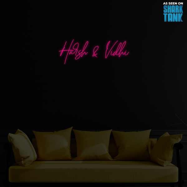
Neon light boards, when installed in the living room, give good results above a sofa, on top of an entertainment unit, or fronting a feature wall. In the bedrooms, neon lighting installations are done above the headboard, near reading corners, or close to dressing tables. These positions keep the neon lighting in places that allow adding to the ambiance without hindering daily locomotion or sleep routines.
Try not to position a neon sign where glare or direct brightness can be a problem, such as straight above eye level or near reflective surfaces.
Using Height, Spacing, and Wall Position Strategically
Mounting height affects how neon lights are perceived. Boards placed too high may lose visual impact, while those placed too low can feel intrusive. Aim for eye-level placement or slightly above for balanced viewing.
Spacing is equally important. Allow enough distance from ceilings, shelves, and furniture so the neon light board feels anchored rather than squeezed into the layout.
Choose Soft Glow Over Harsh Brightness
One of the biggest styling mistakes is choosing neon lighting that is too bright or intense for indoor spaces.
Why Warm and Neutral Neon Tones Work Better Indoors
Warm and neutral neon lights create a soft, inviting glow that feels comfortable for long-term use. These colors blend naturally with modern interiors and enhance relaxation, making them ideal for bedrooms, living rooms, and reading areas.
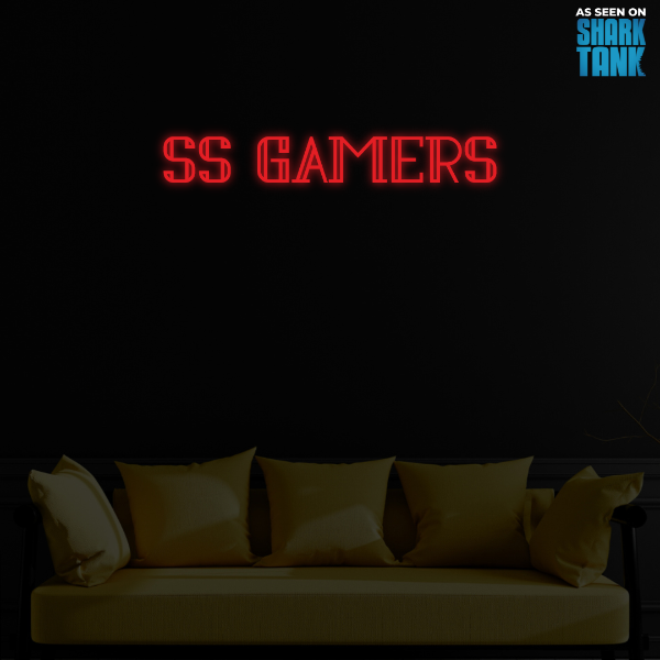
Bright reds, blues, and greens are better reserved for creative studios, gaming rooms, or entertainment spaces where bold energy is desired.
Using Dimmers and Low-Intensity Lighting for Subtle Impact
Dimmable custom neon signs offer greater control over brightness. Lower-intensity lighting allows neon lighting to function as ambient illumination rather than harsh spotlighting. Adjusting brightness based on time of day or mood keeps the lighting versatile and easy on the eyes.
Subtle glow is the secret to making neon lights feel sophisticated instead of overwhelming.
Let Neon Complement, Not Compete
Neon lighting should work with your decor, not against it.
Mixing Neon with Art, Shelves, and Wall Decor
Neon light boards complement wall art, floating shelves, and minimal wall decor very nicely. It is recommended that a customized neon sign or neon light name be used in conjunction with other wall decor rather than competing for space with multiple bright elements.
A combination of materials such as wood, fabrics, and matte finishes can help create a balance with a softened glow.
Keeping One Statement Piece Per Wall
A simple rule to keep in mind is one statement piece per wall. If you have a bold neon sign or a neon light board, let this be the statement piece. It would be distracting to place a lot of bold illuminated neon signs in one area, as the eye becomes confused.
One well-placed custom neon light can have a greater impact than a number of competing design features.
Final Thoughts
Achieving a well-styled neon light board is all about balance, placement, and purpose. Identify if you want a neon light, and if it is adequately matched by selected colors, light intensity, and decorations, then this type of lighting is useful.
By using a neon sign as a design accent, rather than a distraction, homeowners benefit most from the warm, unique, personalized, and contemporary charm that a neon sign brings into the interior context. By using proper interior design techniques and creating unique neon signs through Neon Attack, the popularity of a design aspect fades away, making way for a permanent mark on contemporary interior design.